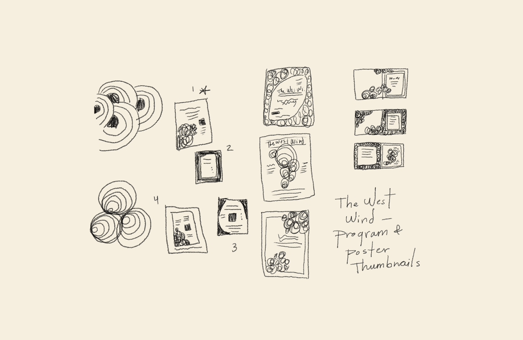
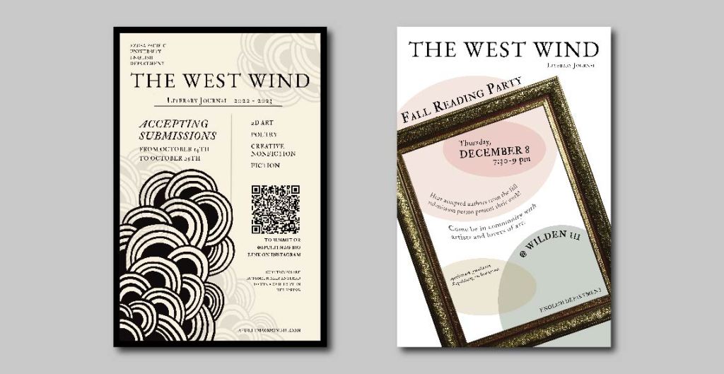
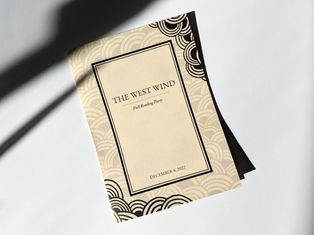
Program, poster, and book design.
The West Wind is a university’s literary journal of student art and writing. The theme of the journal is changed annually. This year’s theme challenged me to combine the minimalist aesthetic with the odd and whimsical.
Client: The West Wind Literary Journal
Team: Calli Cox – Design Lead
Overview
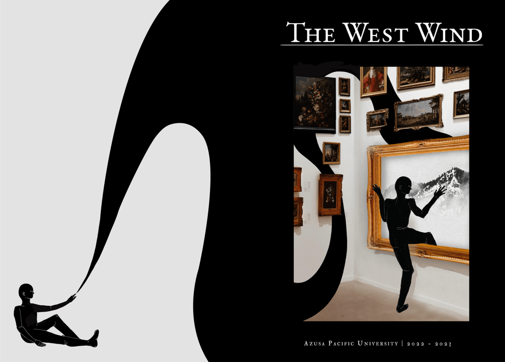
The West Wind editors requested that the journal represent transition, a step from one place into another. The finished journal reflects beauty in simplicity while venturing out of the norm.
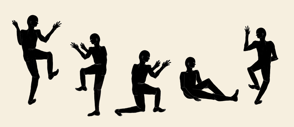
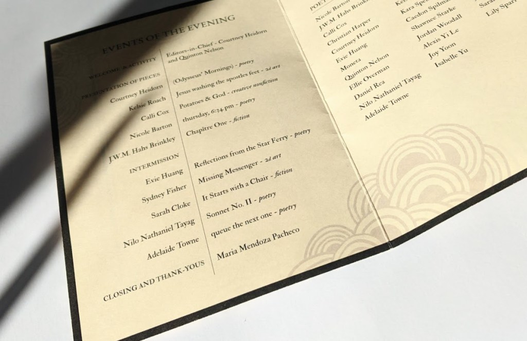
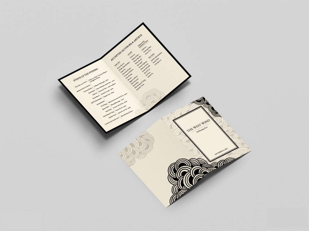
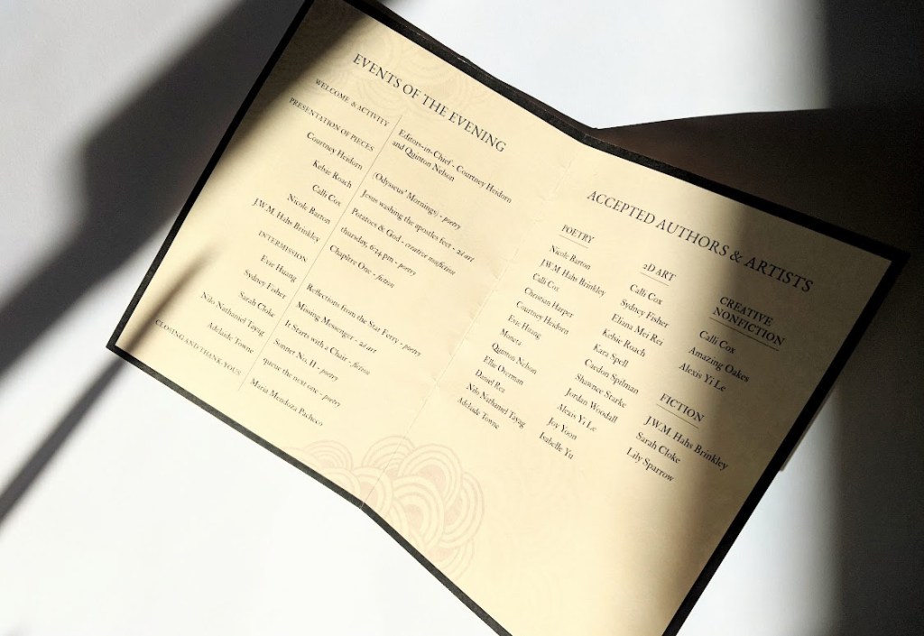
As the graphic design assistant, I illustrated various elements, designed posters and programs, and worked on different sections of the journal’s cover and contents.
Creating The West Wind’s Theme
I was provided with a mood board to get a feel for the brand and potential color palette. Throughout the year, I found myself doodling a repeating pattern in my notebooks. This pattern sparked the beginning concepts for the journal and promotional material.
Book Design
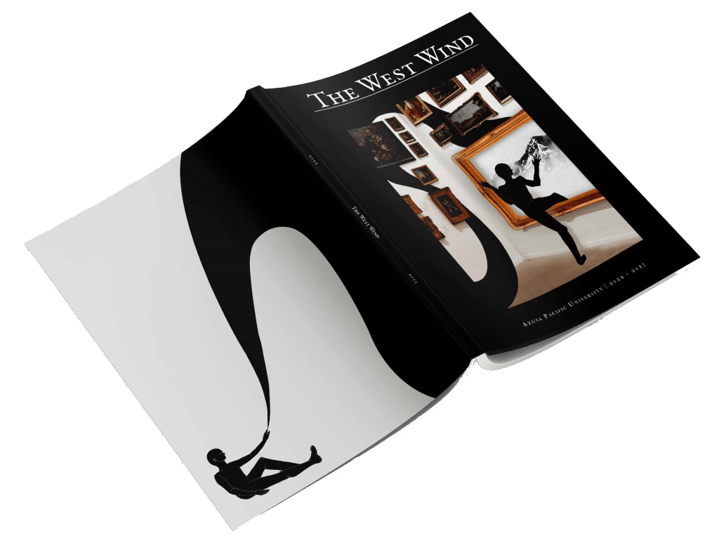
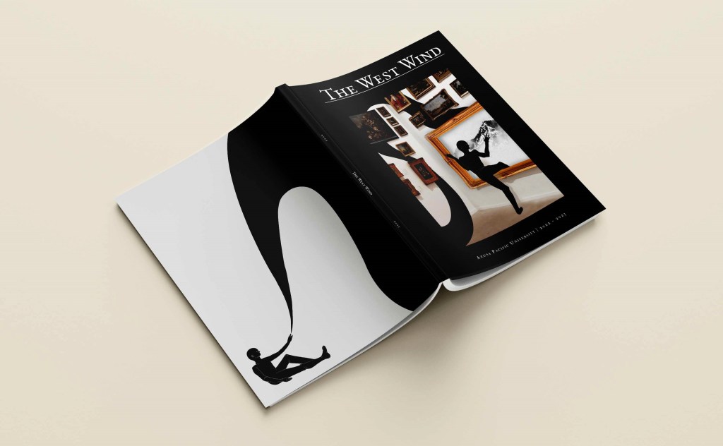
The front cover features an art gallery and a human-like figure to represent the theme’s message of stepping into something new. I designed a back cover to connect to the front, adding to the concept of transition.
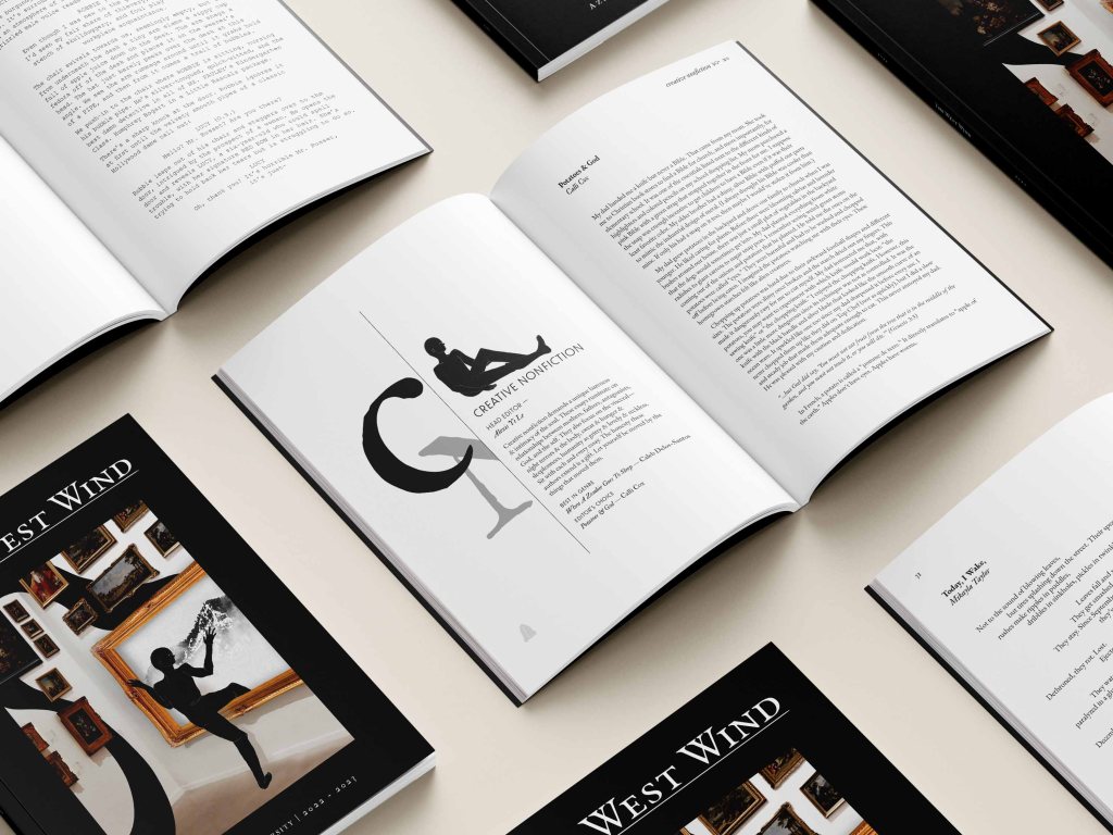
To create a parallel between the silhouette in the gallery and the reader’s action of stepping into the journal, silhouetted people add a human touch to the journal’s clean minimalism by interacting with its contents.