Branding and creative direction for a student art club.
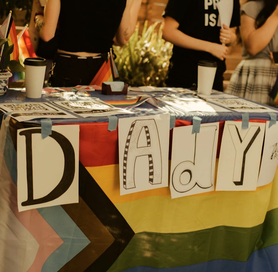
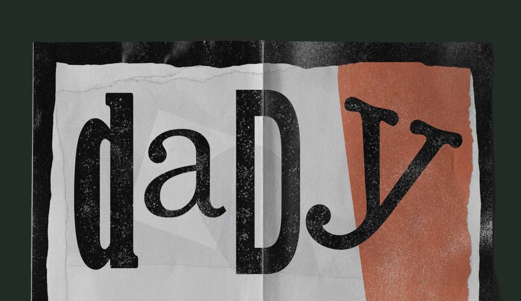
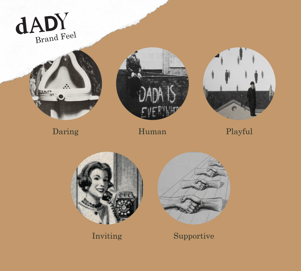
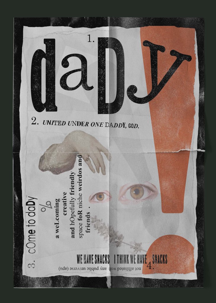
DADY is a student arts and crafts-themed club and underground GSA. It is experimental and lighthearted in nature, remaining fully student-funded in rebellion against strict university club policies. Taking inspiration from the “DADA” art movement of the early 20th century, DADY represents solidarity in the midst of uncertainty and collaboration through creativity.
Project Type: Personal
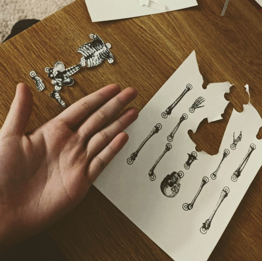
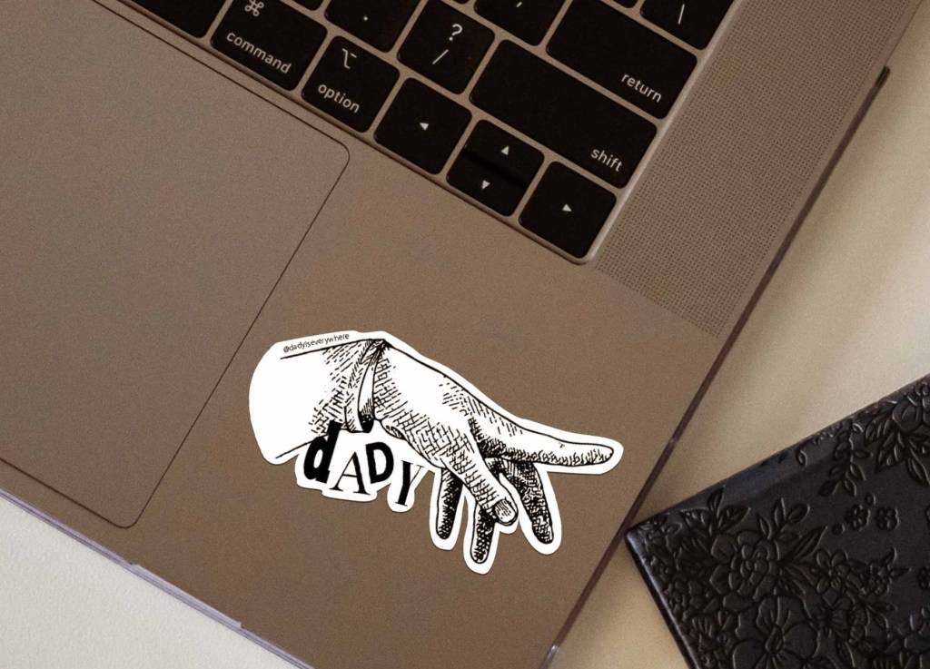
Team: Mataes Ledezma – Hand Illustration (Logo), Social Media Coordinator
Overview
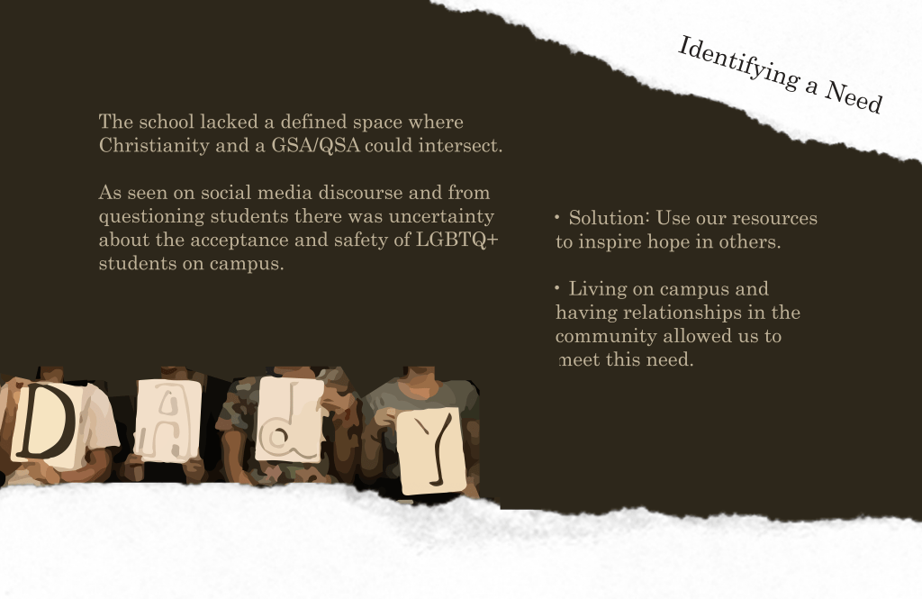
During an uneasy time at our university, a friend approached me with a need for an inclusive community space on campus. In the middle of our serious conversation, a humorous miscommunication led to an inside joke. Alas, our club with its ambiguous name, “DADY” was born.
As the creative director, I designed and planned projects to ensure all content followed our brand direction.
DADY Imagery
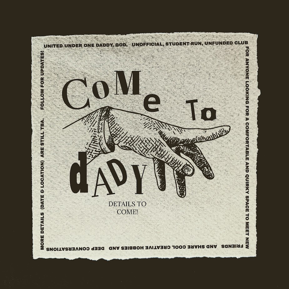
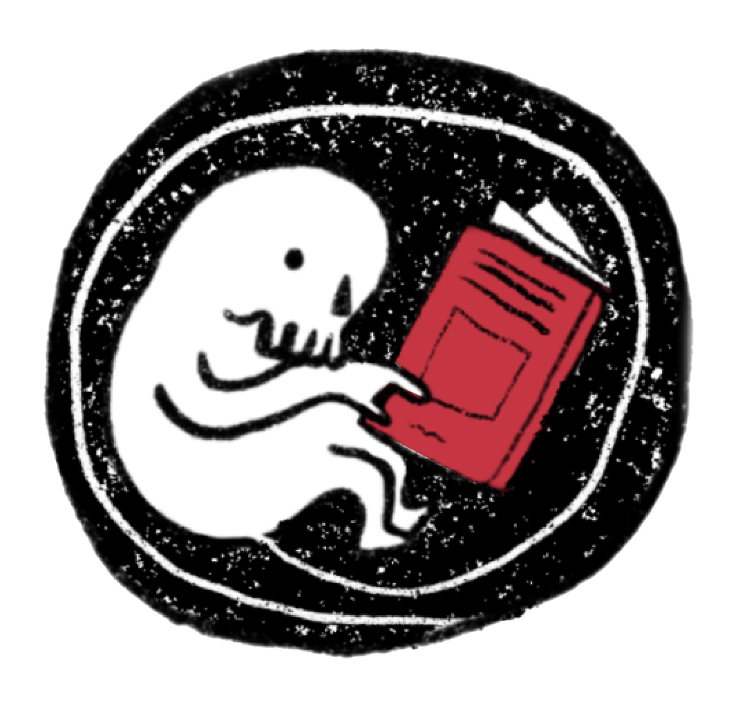
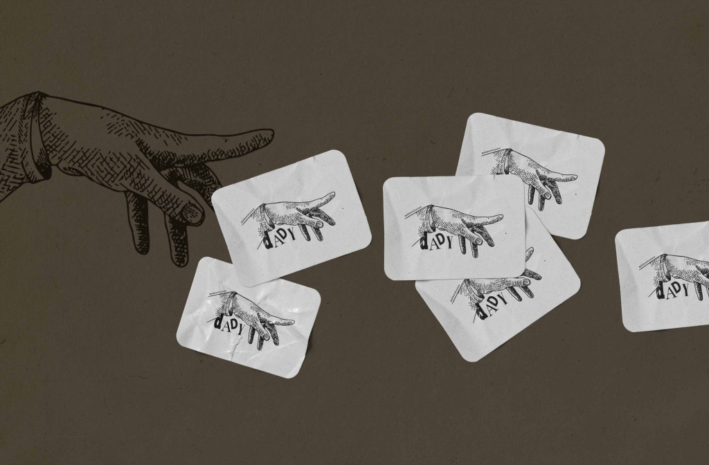
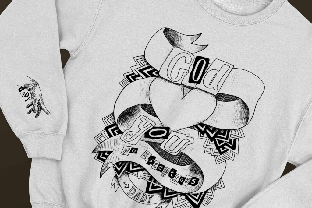
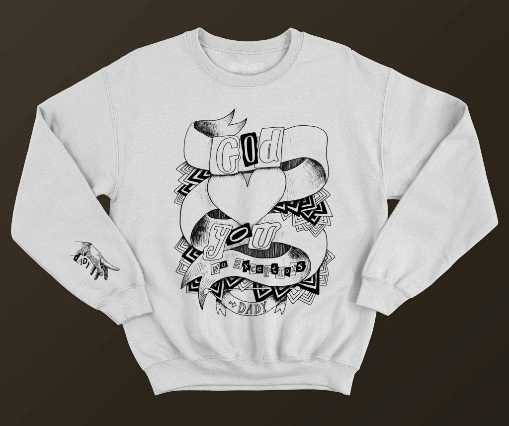
Along with taking inspiration from history, DADY represents an intersection of faith and LGBTQ+ identity. It playfully displays how these two worlds meet and unite, as they do in everyday life. As a result, DADY’s brand merges familiar imagery and language: a hand from Michaelangelo’s Creation of Adam becomes reminiscent of vintage iconography and secret symbols.
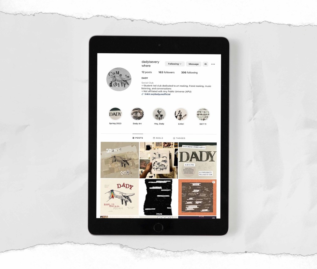
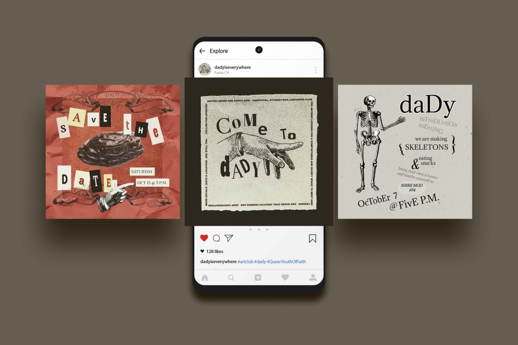
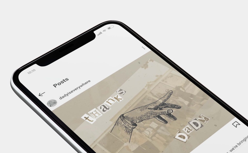
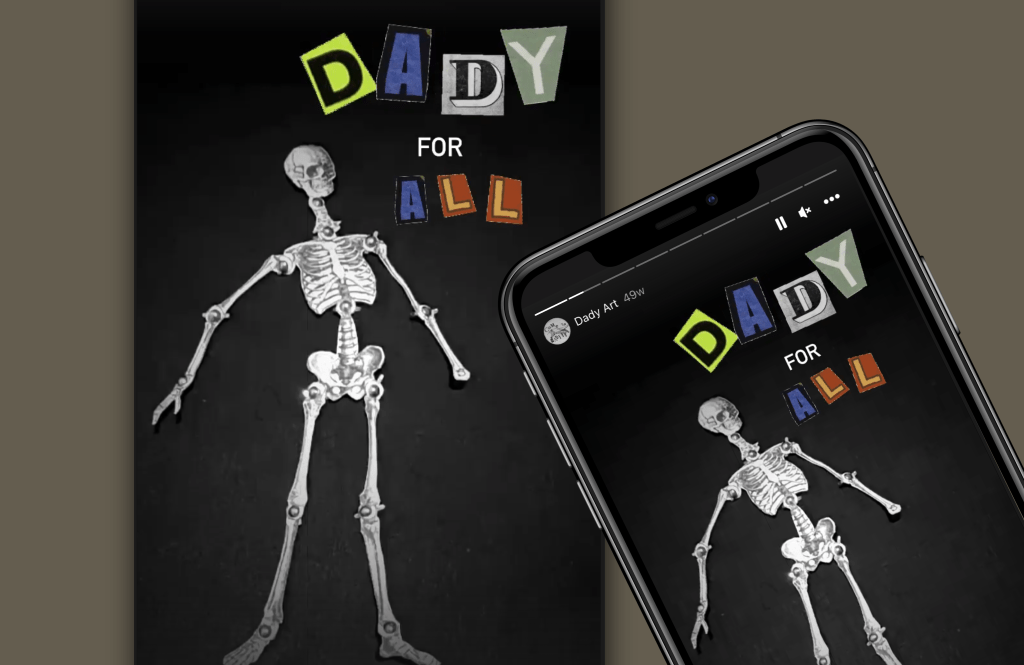
Social Media Launch
With DADY’s vivid imagery in mind, we introduced the club and encouraged brand familiarity starting with Instagram posts. Recognition of the name “DADY” began as a whisper passed between giggles. As DADY became commonplace, it remained an intriguing conversation starter.
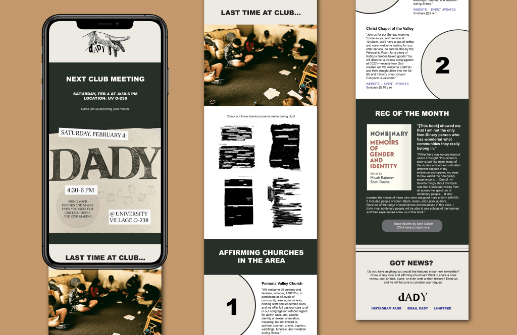
Not long after, we organized a community group chat and monthly email newsletter. This newsletter, featured below, contained a selection of the following: a list of nearby events and churches, art history, meeting details, previous projects, links to reading material, and health resources.